Warning. Many puns ahead!
The writing may be on the wall, but Benjamin Moore’s, Caliente is in a heated competition for the COTYs. In the Dulux world of Beauti-Tones, they all think they’re a Sherwin, but if you can’t Behr to SICO-lour compete any Moore, then at least learn why they do.
Sorry.
Once upon a time, the Pantone Colour Institute (the people who brought us this year’s Greenery) was known for developing colour standards for graphic design. In a stroke of brilliance, they moved into the world of colour forecasting for various industries. They practically created the market for predicting colour trends as a way of marketing their products.
Hardware or décor? What is paint?
Remember going to the hardware store for paint? It’s only been considered a décor item for around 25 years. The paint industry has been working hard to roll with the design industry, making colour a “thing”. This allowed Pantone to brush past the paint industry and capture the colour trend market, all the while dealing with industries, not the consumer. But who sells paint? The list above (albeit pun-ny) deals with consumers. They know what people want to buy.
Now, every paint company presents—with varying degrees of fanfare, a Colour of The Year (COTY) so let’s have a look at this year’s batch.
Behr COTY
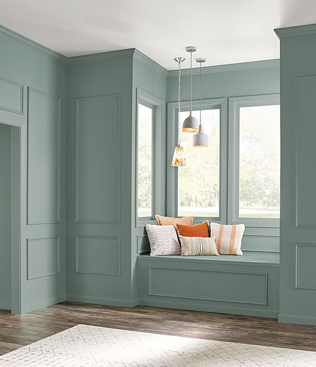
Behr Paint (Home Depot) enters the race for the first time ever with, In The Moment T18-15 where, “Spruce blue, soft gray and lush green coalesce into a fresh shade that evokes a sense of sanctuary and relaxation amid our always-on lives.” Love that description.

Photo credit: Behr Process Corporation
SICO COTY
 SICO says, “…add a touch of elegance to your home with a sophisticated, stunning and unexpected neutral”. Their choice for 2018 is Cast Iron (6173-83). In their words, “…black paint highlights a perfect mix of modern, yet timeless sophistication”. So, their colour of the year is black.
Dulux COTY
 Dulux’s Global Aesthetics Centre’s colour specialists (breath) crowned Heart Wood (10YR 28/072) as their 2018 COTY. They describe it as a beautiful, warm pink. Also: calm, cozy, relaxed, energetic. Yes, the ‘80’s are back and new to a whole generation who never experienced dusty rose, the last time around.
Beauti-Tone COTY
Beauti-Tone, the only wholly, Canadian-owned paint brand (Home Hardware Stores Limited) presents, Green Peace. A blend of earthy, camouflage green, blended with a soft botanical green. Creative director, Bev Bell says, “Green Peace is a soothing, balancing colour with strong energy.” I must agree.

Photo credit: Home Hardware Stores Limited
Sherwin Williams COTY
 Sherwin Williams offers a mash-up of rich blue with jewel-toned green for their 2018 entry. Oceanside SW 6496 is both, “accessible and illusive”. This colour plays well with others, especially if you’re looking for a blue to enhance your mid-century, wood, furnishings. Their suggestions for colour combinations may be a bit daring, but they get extra marks for pushing vivid colour.
Benjamin Moore COTY
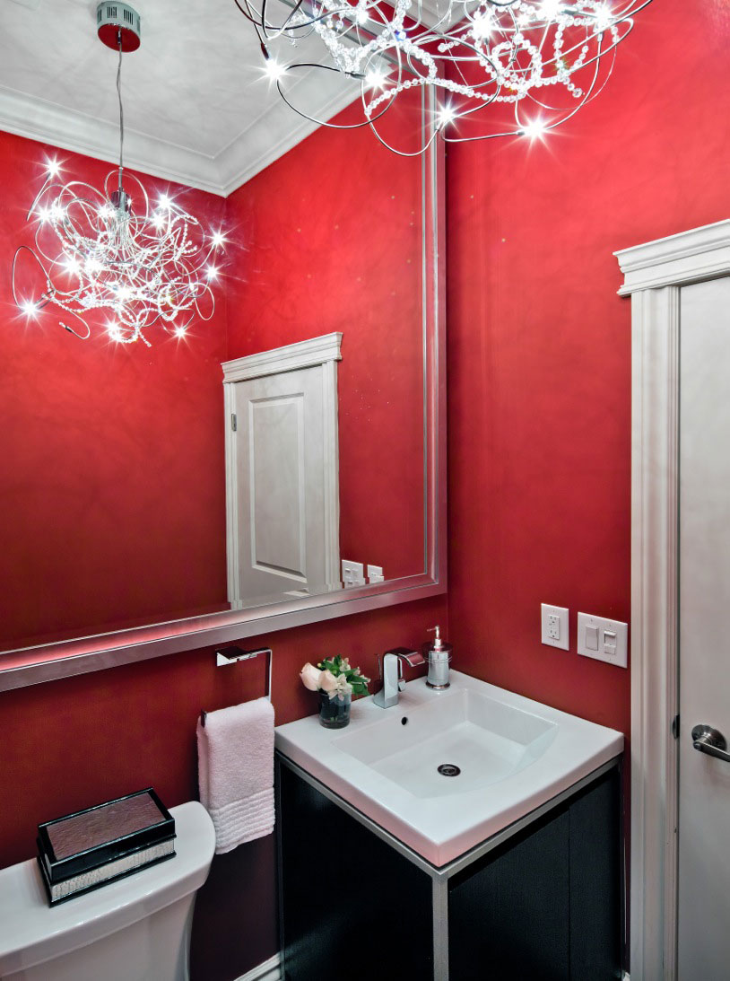
 Benjamin Moore decided (as if there was one person named, Benjamin Moore) that “he” would like to set the world on fire with the hottest colour. Caliente AF-290 is, in a word, hot! I’ve used it in powder rooms because it really makes a statement in a small space.
Pantone COTY
Back at Pantone, or more specifically, Pantoneview Home + Interiors, they have presented the world with 8 palettes. They say metallic colours are more neutral, iridescent finishes are growing in popularity, shiny is big, so are intense colours and subdued hues. So, everything is in.
Basically, the battle for COTY is not a battle at all, If you like a colour. In my opinion, every colour is a winner, and remember it’s just paint. Explore, experiment and enjoy, now!

