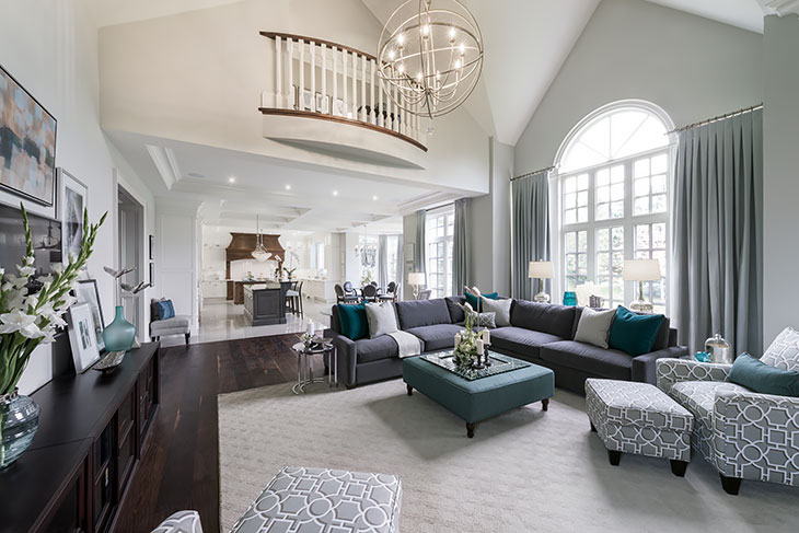
More homes are being built or renovated to reflect the trend of open concept living. There are so many benefits to this style of home. Open concept homes feel larger and often brighter. The downside is they are harder to decorate.
A large trend in open concept is to have the kitchen, dining room and living room all interconnected. This layout can be quite challenging if you, as the homeowner, want to use different colours or themes in these spaces. With each room leading into the next and unobstructed views of all the rooms at the same time, there has to be a level of continuity in your design and colour choices.
My first suggestion would be to keep the same colour and theme throughout these spaces and to treat them as a large open room. This will make the space feel connected, calm and serene. Colours I would suggest for these types of spaces would be neutrals that aren’t too strong, as you don’t want to overpower the space.
Here are some of my suggestions:
- Blue: Benjamin Moore’s Mount Saint Anne
- Green: Benjamin Moore’s Herbes de Provence
- Yellow: Benjamin Moore’s Dijon
- Grey: Benjamin Moore’s Revere Pewter
So many homeowners love to use colour (almost as much as I do!) and yearn for something different. If this is you, I would suggest using varying shades or hues of the same colour. This will allow you to use different colours while keeping a feeling of connection throughout the space. A sense of flow is very important when moving from one room to the next and this is something that is essential to achieve when choosing colours for your space.
If you are unsure of where to end one colour and begin the next, start by defining the spaces. If two rooms shares a wall, do not paint half the wall one colour and the other half another. This may sound simple, but I have seen it done! Always remember it is ok if not all four walls are the same colour. If you have a long wall that joins two spaces, keep it the first colour and paint the other three adjoining walls the next colour. Another trick is to change the colour when the wall comes to a corner.
Colours that work well together like this include:
- Benjamin Moore’s Gray Owl
- Benjamin Moore’s Smoky Green
- Benjamin Moore’s Cool Breeze
And finally, the last way to decorate a space like this is to paint all the walls the same neutral colour and then paint your focal wall a contrasting colour. This wall should be the first wall you see when you walk into the space. This is your “Money Wall”. Keep in mind, this doesn’t have to be the wall that the fireplace or TV are on. Once you paint it a different colour, your eyes will naturally be drawn here. You can then add a mirror or make a statement with some artwork!
Colours that work well together include:
- Benjamin Moore’s Dark Basalt – for the accent wall
- Benjamin Moore’s Beach Plum – for the remaining walls
No matter how you choose to decorate your space, all that matters is that it speaks to you and your family and it is a space you love being in!

