Confused about home decor colour? You’re not alone. We all love colour!
Think back to when you were young, and you could choose any colour you wanted when you were drawing a picture. Today, when it comes to surrounding yourself with colour in your home, there are no rules. Decide with your heart.
Here are some common questions I get asked about colour. I’m using Benjamin Moore paint colours for my advice to reader’s questions.
Dear Jane,
To make my rooms feel bigger what’s better – dark or light colours?
Cramped
Dear Cramped,
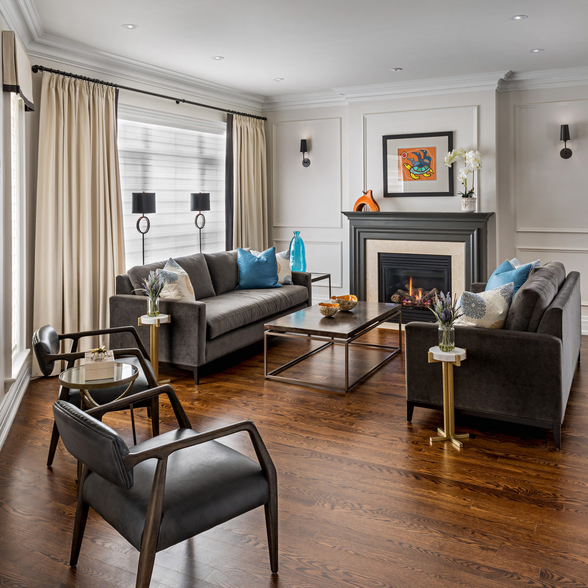
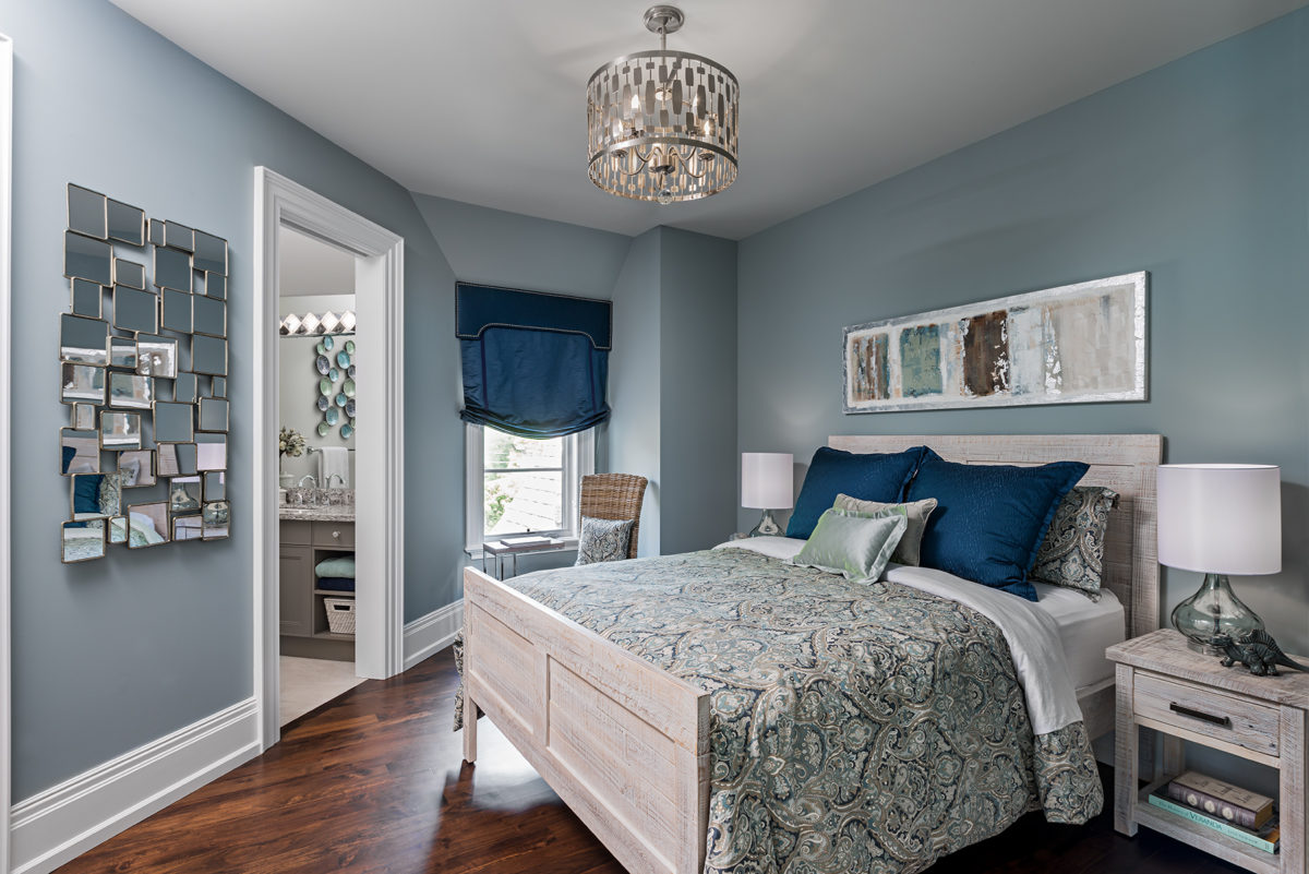
It’s not colour, the issue is contrast. High contrast is when you put black up against white, like a tiled floor. The more contrast you have the smaller a space feels because your eye has to work harder to distinguish contrast. So, low contrast would be white with white, or cream with cream, for instance. That’s what you might choose for a light and airy feel.
The only danger of low contrast rooms is it can get boring, pretty quickly, so add in accent colours or colourful accessories.
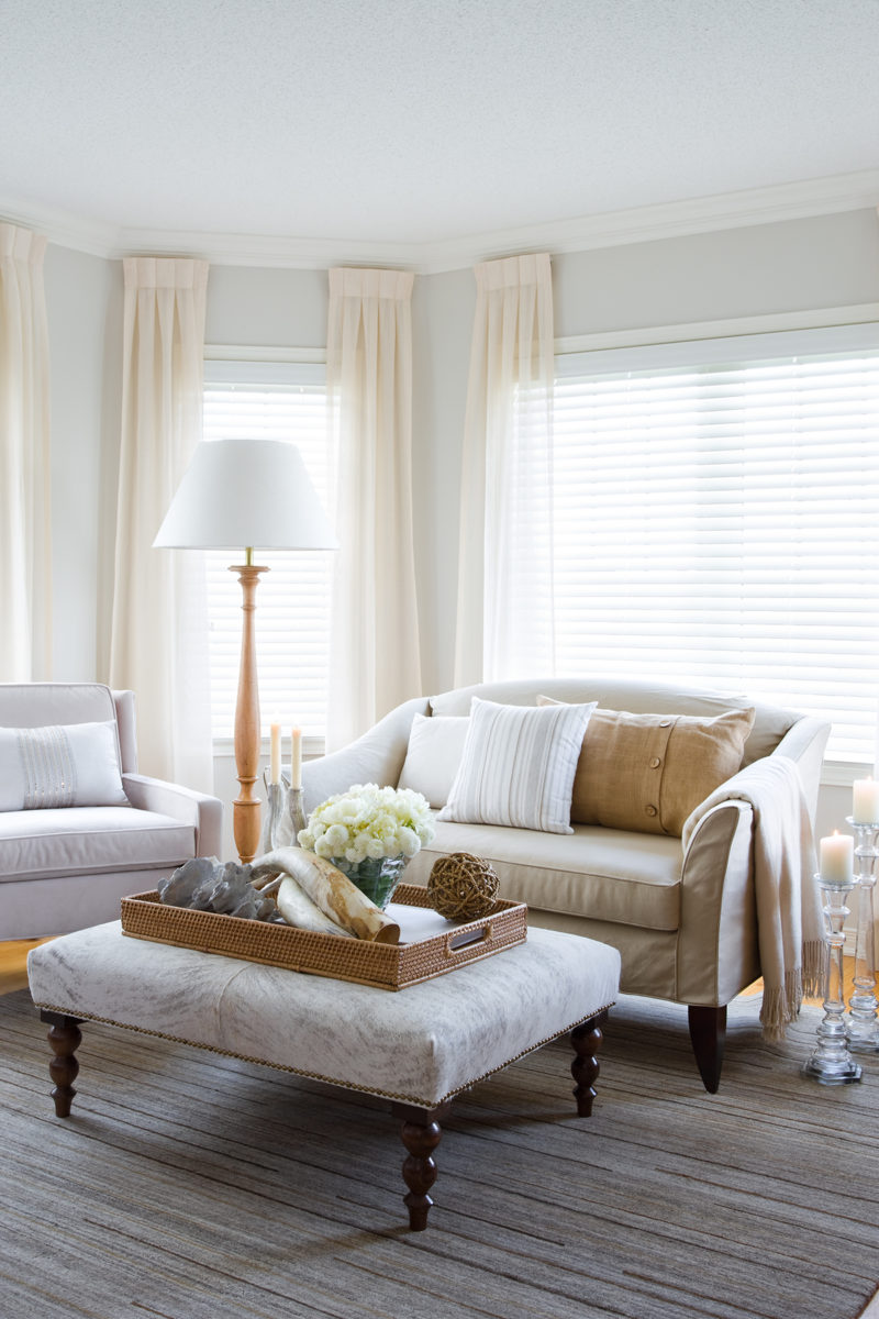
An example of low contrast.
Speaking of contrast, if you want to highlight light colours (like cabinetry, etc) you can make it look lighter and pop out more by adding a deep colour behind it.

Darker colours make the cabinets stand out.
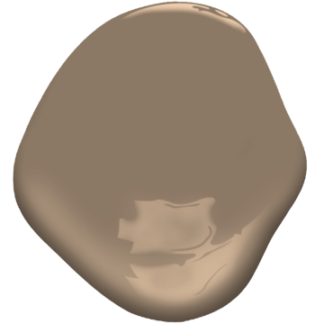
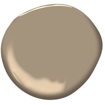
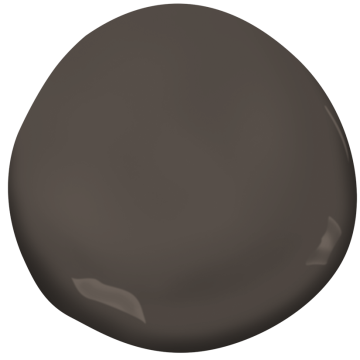
For example, honey oak kitchen cabinets will look lighter with a deep chocolatey-colour like Marshlands (CC-512), Davenport Tan (HC-76), or Alexandria Beige (HC-77) behind it.
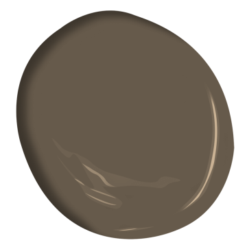
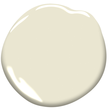
Benjamin Moore Marshlands
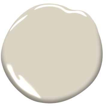
Benjamin Moore Davenport Tan
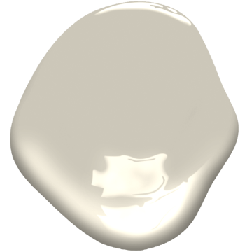
Benjamin Moore Alexandria Beige
Dear Jane,
I have a lot of dark furniture. Can I lighten up my room by painting the walls a light colour?
Underwhelmed
Dear Underwhelmed,
We don’t get a lot of year-round light in northern climes, and in winter the amount of daylight we get is limited. Lightening the walls only will create a lot of contrast (see above), you may want to consider adding more sources of lighting, and replacing or painting the furniture so it blends.
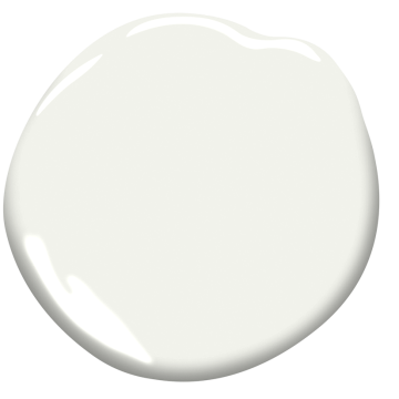
A simple white paint colour can help lighten a room but also consider adding more lighting.
Walls don’t have to be white to be light (although I do have my favourites). Look at a taupe/beige like Benjamin Moore’s White Down (OC 17) or if you still want a crisp white that is still warm, try Oxford White (CC-30).
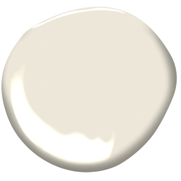
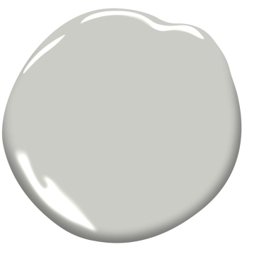
Benjamin Moore White Down
Benjamin Moore Oxford White
For a brighter room, you may want to look at colours with yellow in them but are not necessarily yellow, like Monterey White (HC-27). My go-to selection of light colours with some action in them are Stonington Grey (HC-170), Revere Pewter (HC-172) and Edgecomb Grey (HC-173), they tend to look good with everything.
Benjamin Moore Monterey White
Benjamin Moore Stonington Grey
Benjamin Moore Revere Pewter
Benjamin Moore Edgecomb Grey
Dear Jane,
My happy place is by the ocean and I want to bring that feeling into my home. I’m drawn to sea-foam and teal colours but find them too bright for my very, Canadian home. Any suggestions?
Beached.
Dear Beached,
Ocean-colours are beautiful.
Mount Saint Anne adds an ocean blue that works with all wood tones.
You can achieve that look without the brightness with blues and blue-greens like Benjamin Moore’s Mount Saint Anne (CC-710). It looks great with all wood tones.
Benjamin Moore Mount Saint Anne
Dear Jane,
I love the look of a dark, painted accent wall. Is that out of style?
Confused
Dear Confused,
Let’s end the confusion. Accent walls are very popular and look fantastic if you have something to accent. I like to accent one wall and put something fabulous on it like a great mirror or artwork.
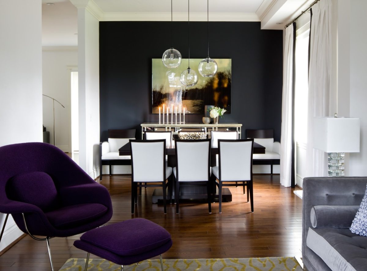
Dining Room with dark, dramatic accent wall.
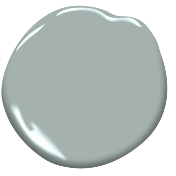
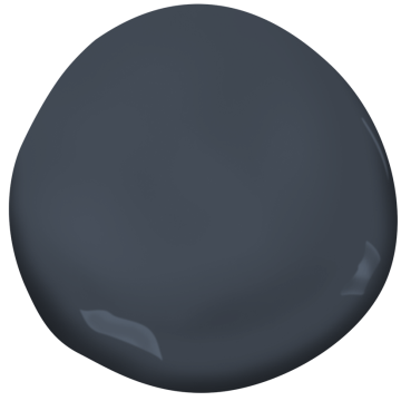
My favourite accent wall colours are deep, rich and dark, like Kendall Charcoal (HC -166), Hale Navy (HC 154) and Willow (CC-542). Alternatively, wallpaper is back in style and makes a great accent wall statement.
Benjamin Moore Kendall Charcoal
Benjamin Moore Hale Navy
Benjamin Moore Willow
Whether you want to make your front door stand out, or brighten up the inside of your home, do it with colour and make your own rules!
Please share this post if you found it to be useful.