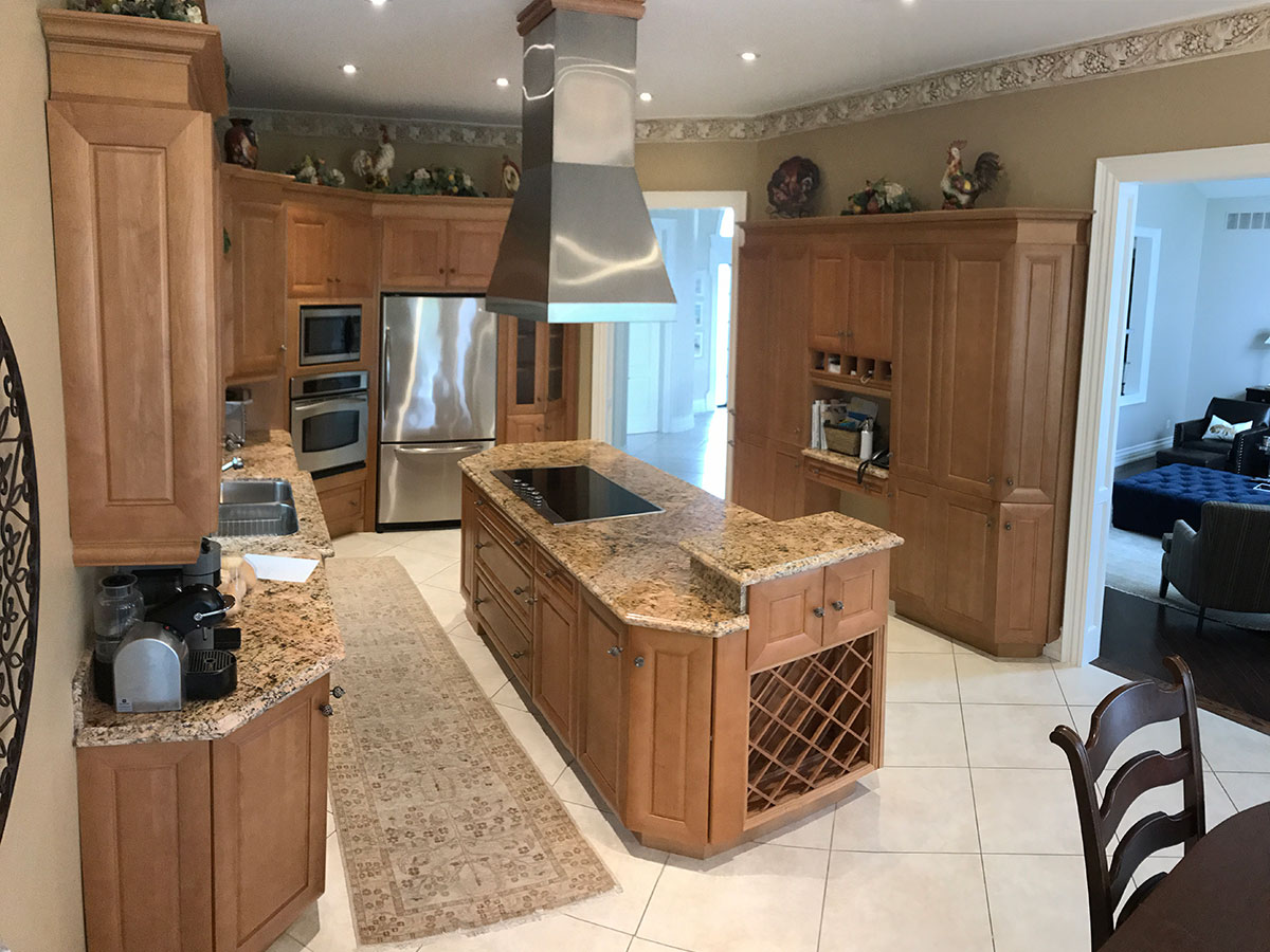
My client moved into their 1980’s home over ten years ago. Over that time they realized their dysfunctional kitchen needed a functional makeover.
Roosters and Grapevines and borders, Oh my!
The large kitchen takes up a quarter of the house’s main floor and includes an eat-in dining area. It features tall ceilings, granite countertops and custom-made cabinetry with plenty of storage. At first glance, it’s a beautiful space, but somewhat dated.
The homeowners called us to do more than take care of (eliminate) the roosters, grape vines and wallpaper borders. This kitchen needed more than a décor update, it was a dysfunctional space with a problematic layout. We discussed the problems:
Range Hoods on Islands Can Be A Hazard
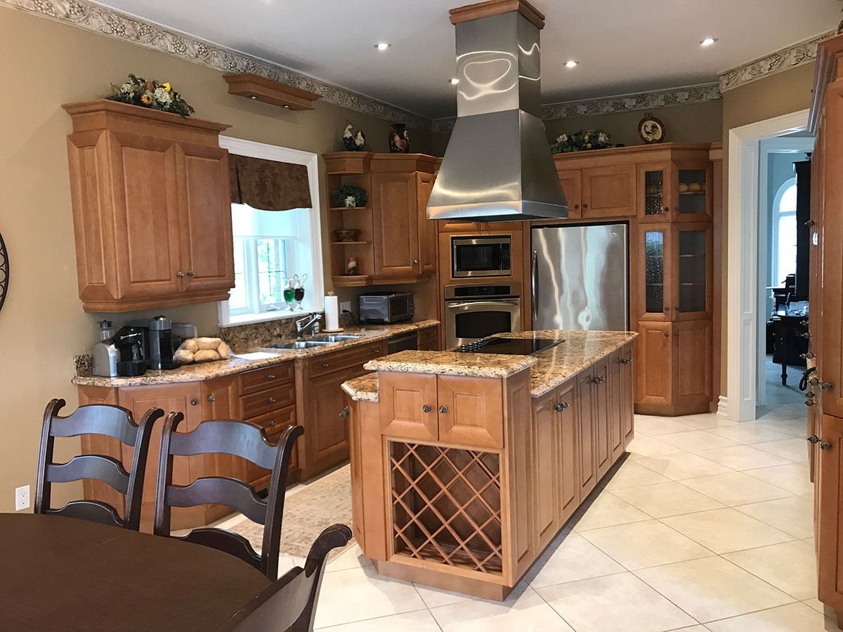
The range hood over the island in the center of the room looks impressive until you have to work under it. The homeowners are of average height but the hood presented a hazard when they leaned over the stove to cook.
Narrow Space Causes Dysfunction
The narrow space between the island and sink meant only one person could work comfortably at a time. There were also logistical issues when one person opened the door under the sink or washed dishes while someone was at the stove.
Corner Appliances (Secretly) Don’t Work
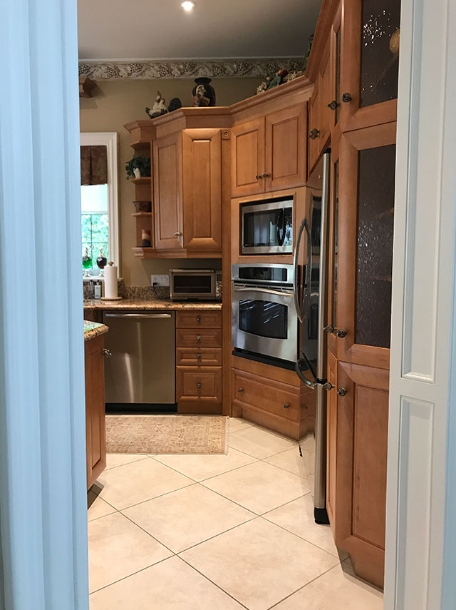
The stacked, built-in oven and microwave in the corner, angled wall, looked practical until you had to get something out of the fridge while opening the oven door. You couldn’t do both at the same time.
For all the built-ins and spacious pantry cabinets (with coffee bar), the toaster oven didn’t fit and had to sit on the counter, taking up space. For a large kitchen, it had a lot of restrictions.
How to go from Dysfunctional to Functional in one Makeover
The space, in general, was in good enough shape that it didn’t require a renovation. The plan: keep the floors, update the lighting, keep the dining area, repurpose or donate the cabinetry, fixtures, and appliances and rework the function of the space.
Work triangle replaced by work zones
We started by drawing new plans to address every complaint about the kitchen’s function. We proposed repositioning the major work areas and banish the work triangle. Yes, the work triangle was a very practical concept when kitchens were built for efficiency but our kitchens have become a part of our lifestyle and it’s now the center of the home.
After World War II, three work areas were needed; refrigerator, stove/oven, and sink. Counter space was not a big consideration because it was only used to prep one meal at a time, not as an area for entertaining. Today we work with zones; storing, prepping, cooking, serving and cleaning. Each needs room to function.
New Layout and Cabinets, Existing Walls
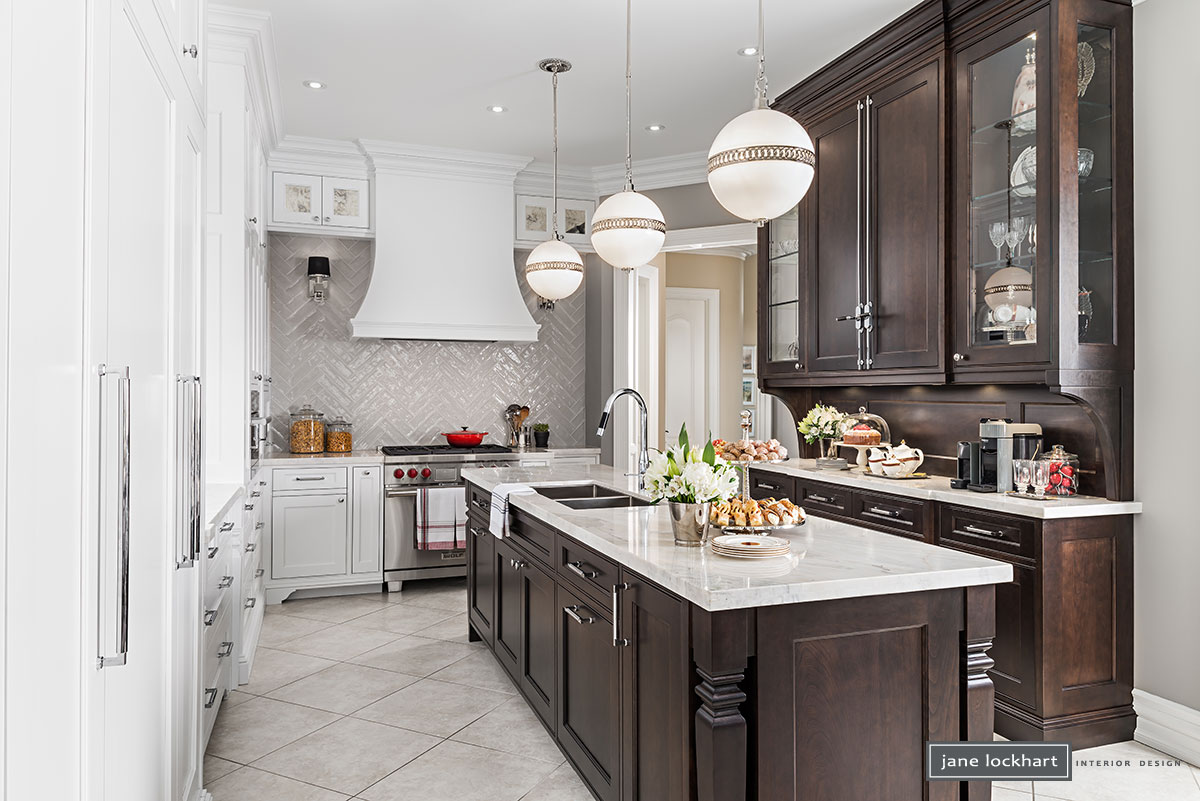
Working with custom cabinetmakers, Downsview Kitchens, in the original footprint, the new layout works well for more than one function (or person) at a time. The cooking surface commands its own presence, with the Wolf range and cooktop and impressive, curved range hood. It’s backed by a shiny-tiled, chevron-patterned backsplash.
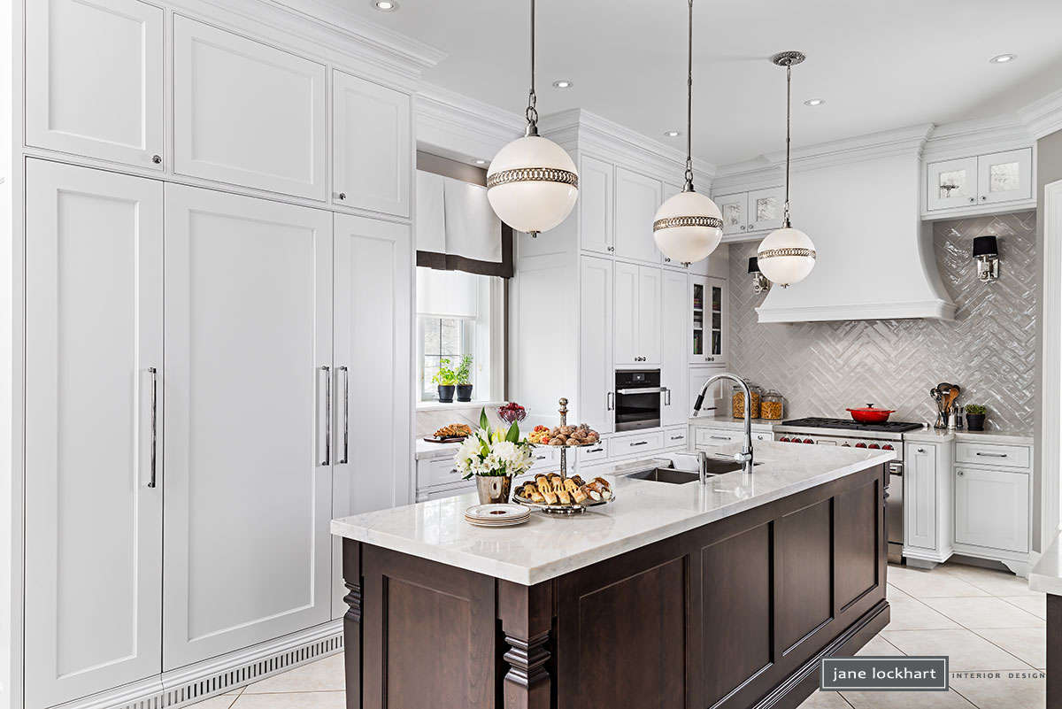
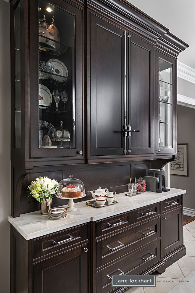
The sinks were moved to the island, with lots of room to wash, dry and put away dishes. The built-in fridge, paneled in crisp, white cabinetry blends in and has enough space around it to function well. The servery’s contrasting dark wood tones add a French Bistro feel, especially with the classic touch of the Cremone Bolt detail.
A Functional Kitchen for the Whole Family
To ensure function for the whole family working in this space simultaneously we reserved a drawer in the island adjacent to the sink for the garbage and recycling.
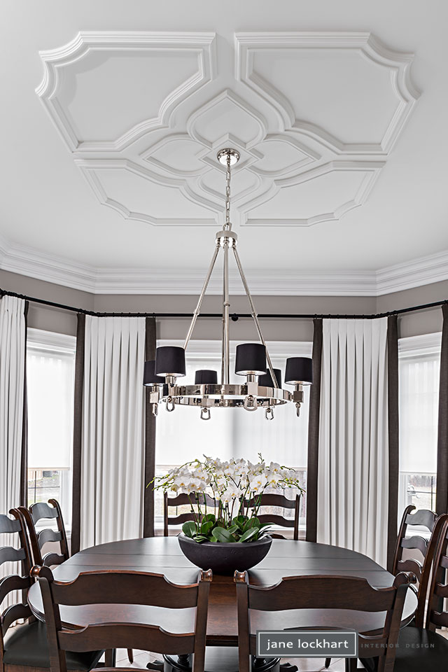
Finally, the dining room ceiling received new decorative trim and custom, tailored drapery to complement the new kitchen. Now, the roosters have flown the coop and this kitchen functions better than ever.

