After studying colour for over 20 years, and working with clients and contractors in our design practice, I have seen the trends come and go.
As we reach peak white and the modern farmhouse trend gives way to other styles, some related and some not, a less bright palette of white paints is on the horizon. Other styles and colour palettes are less high contrast and somewhat more tonal. That’s not to say colour hasn’t become more popular but for those who are looking for white.
The prevailing direction is moving towards one that is slightly coloured or more toned, softer, and tends to blend with surrounding colours rather than the clearer whites, of the last few years.
Here is an updated list of white paint colours for walls and trim in 2022! Most paint suggestions are from Benjamin Moore.
White Dove (OC-17)
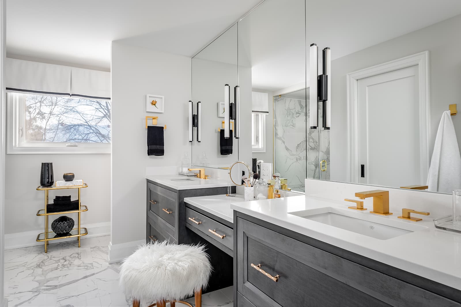
 White Dove (OC-17) is one of our major go-to colours for kitchen cabinetry. With the popularity of light wood floors, this is bright enough to be white and won’t disappear into the floor. In addition, it’s slightly creamy without being yellow or smoke stained which some tinted white paints can look like when combined with grey-blue-based colours.
With any darker or mid-toned wall colour like moss or olive green, it will read as white but won’t appear sharp. If you want something sharper, have a look at Decorator’s White (CC-20).
Soft Chamois (OC-13)
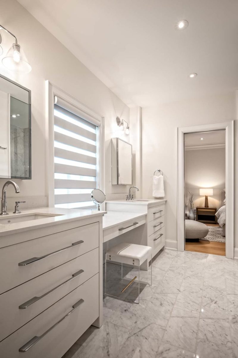
 One of my clients suggested that I look at Soft Chamois (OC-13). I experimented with it and found it to be a great colour! As a truly clear creamy white, with a greige (grey-beige) undertone, it is an excellent choice for painting:
- trim
- walls
- applied wall panel moulding
- ceilings
If you’re looking for an option to remove all contrast in a room using paint colour, this is the choice. It’s definitely a tinted white, yet it’s clean, mellow, and leaves no lingering colour aftertaste. By that, I mean that I don’t look at the colour and try to determine what the undertone is. It’s simply a solid colour when applied to any surface. It doesn’t drift to other tones.
This is a great choice against light wood floors with blond or greige tones. It blends beautifully, offering just a touch of contrast.
Chantilly Lace (OC-65)
 Chantilly Lace (OC-65) is the brightest of the toned whites in this list. It has a slight feel of blue-grey to it while making it appear a touch brighter than others. It is a tinted white though, so don’t confuse it with clearer whites lacking colour or depth. Truly, all white paints have a colour but it’s only visible against another white or on a large scale like a wall. All white paints are very sensitive to the temperature of your light source.
Chantilly Lace is an oldie but a goodie. Having seen trends come and go it’s stood the test of time. Classic, fresh, bright but reserved is how I think of this paint colour. It’s not nouveau, but rather sophisticated, and understated glamour.
Wimborne White (No. 239)
Farrow & Ball’s Wimborne White (No. 239) is a tinted white that actually appears fairly white when applied!
It is a metameric colour (as are many of Benjamin Moore’s paints) which means it will blend with the lighting and other colours of the environment in which it is used. This white is rich with depth and a hint of warm grey in the undertone. When applied or used against a blue-based white it doesn’t appear dirty. Bright and slightly warm, Wimborne White appears neutral making it a good choice with any other colours but likely more enjoyable with warmer or neutral colours.
Dune White (CC-70)
 Although Dune White (CC-70) is not a bright white, it appears lighter than Intense White (OC-51), another popular tinted white that drifts quite grey. I have added this as a subtly coloured white with a generally neutral warm tone.
Dune White has a tone that is beige-grey without any yellow. It really leans into its name and reminds me of bleached sand dunes near oceans with intense sunlight overhead. It’s not a bright white. If you want a subtle wall colour, combined with a medium brown, or a greige, warm wood floor, this paint might be a good choice for you, especially f you paint trim and baseboard in a brighter, crisper white like Oxford White. With this combination, you will see the colour change from wall to trim but still maintain a very light room.
As white paints get more colourful, this might be the one to keep a space white but with a definite undertone of a warm hue.
Cloud White (OC-130)
 For overall use, a good warm white paint is Benjamin Moore’s Cloud White (OC-130) which has a touch of yellow and black in it. It’s a bright option for ceilings, rather than the typical premixed ceiling white you buy from the paint store.
With Cloud White, your ceiling will appear brighter and this may contribute to the overall brightness of your room in terms of light reflectance.
White Down (OC-131)
 For an antique white, I definitely recommend Benjamin Moore’s White Down (OC-131) as it is warm and mellow without looking yellow. It feels very natural but still appears white.
This is a great colour for kitchen cabinets if you do not have white appliances and you wish for your space to feel a little more relaxed overall. It really is the perfect antique white without looking old!
Simply White (OC-117)
 My new favourite whites are Benjamin Moore’s Simply White (OC-117) and Oxford White. Simply White is clean and bright but not tinted to appear gray or blue when rolled on a large area. It is sharp but still on the warm side so it’s great with hardwood flooring or wood furniture.
Simply White is more modern than Cloud White as it has even less yellow in it.
Oxford White (CC-30)
 Oxford White (CC-30) is a classic white that again, is more modern than either White Down or Cloud White as it is crisp and moves towards gray. It is not drab but clean and bright. A great choice if you want a strong fresh white for a modern look.
Decorator’s White (CC-20)
 Decorator’s White (CC-20) is the old but great white paint standby! With its classic gray undertone, it has been out of favour over the last ten years but it is perfect if you wish to decorate with gray, charcoal or black. It is a great returning white that will be popular again as it ushers in the next decade.
Compare and review paint colours
The best way to look at white? Review your choice against all the other elements in that space to ensure it actually looks white. And remember, white is the most difficult colour to select as it will change tremendously depending on the type of artificial lighting of the space and your room’s geographic exposure.
You may want to paint a board in your choice of white paint before applying it to a wall. Make sure it has the overall tone you are looking for. These tips should help you get the right white paint colour for your walls.
Follow us on Instagram for more tips.